Let's Talk Illustrators #187: Romana Romanyshyn and Andriy Lesiv
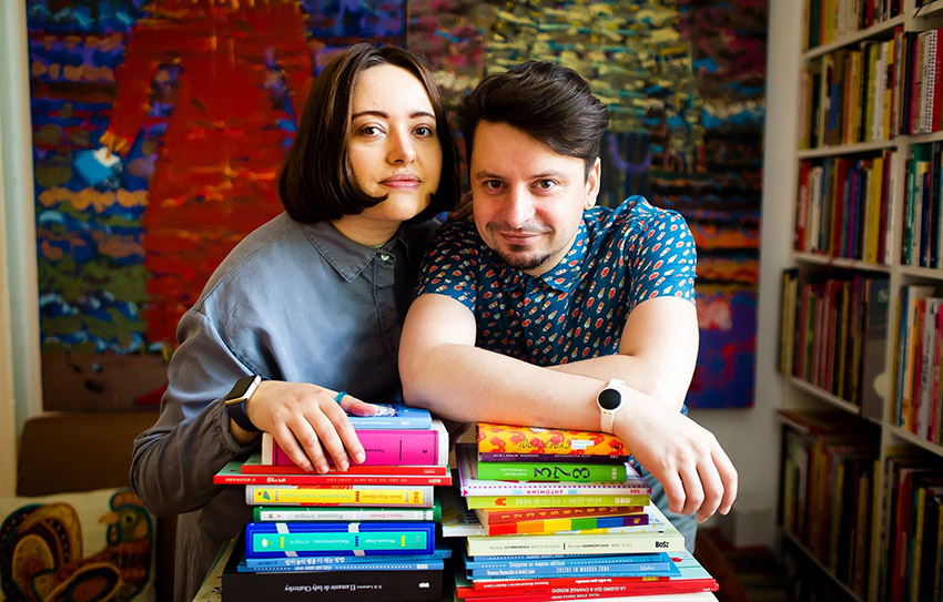
Collaborative duo Romana Romanyshyn and Andriy Lesiv have made some of my favorite books over the years (check out Stars and Poppy Seeds on my Favorites of 2019 list here), so it was an extra special treat to catch them both to discuss their work together. Most recently they published Sight: Glimmer, Glow, Spark, Flash!, a follow up to last year's Sound: Shhh . . . Bang . . . Pop . . . Boom!, and this vibrant series serves as an engaging and immersive set of scientific learning! Enjoy!
About the book:
With compelling visual sophistication and infographics about all aspects of sight, this volume joins Sound: Shhh . . . Bang . . . Pop . . . Boom! as far more than just a groundbreaking introduction to our vivid, sensory world! At once an immediately accessible, science-intensive illumination of an endlessly fascinating subject as well as a sensitive exploration of how sight essentially impacts our everyday lives!
LTPB: Where did the idea for this series of these books, first Sound: Shhh . . . Bang . . . Pop . . . Boom! and now Sight: Glimmer, Glow, Spark, Flash!, come from?
RR & AL: When we were kids, we were very curious about almost everything around us. But back then in our country we didn’t have many books which would tell us about very simple things in interesting way. So this experience of shortage of interesting picture books back than is the main fuel for us now in the process of picking topics for books.
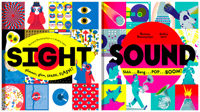
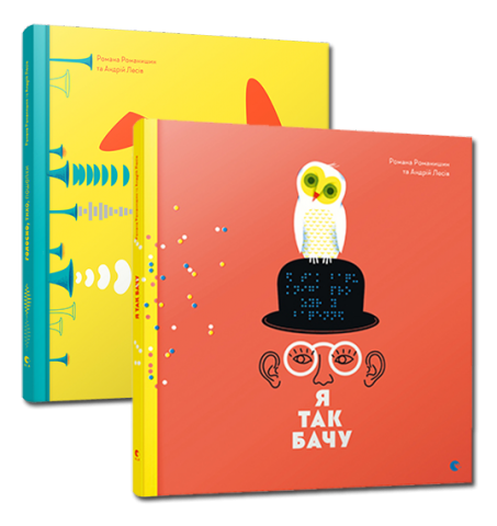
Art and science are two our main interests. We always wanted to create a project which would be a synthesis of art and science, a fusion of emotional and rational perception of the world. We were searching for the idea and started to search right on the surface. The idea of a book about human senses is pretty simple and yet it gives a very bright territory for visual and verbal experiment. We decided to focus on hearing and sight because these senses are most important two and two most abstract. After gathering all the information and being surprised by the depth of this topic we realized that one book would be too narrow for these two senses. They needed two different approaches, so we decided to create a duet of books about audio-visual perception of the world: first one about sound and hearing, and second one about sight and way we see.
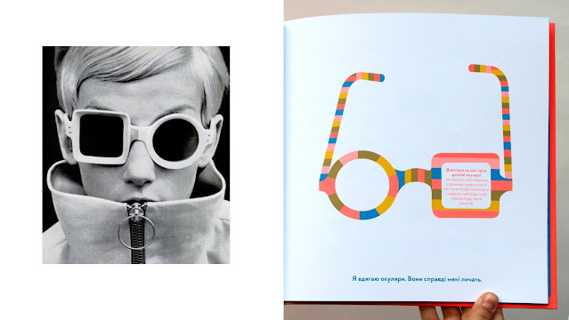
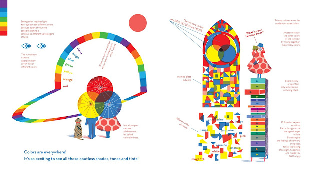
Always when we start new project our first step is to work with information and data. We make research of the theme and gather all the facts and interesting material for the future book. Then we start to think about visual concept, developing the story and characters. In our books we always love to create our characters with some peculiarity. In a nonfiction they become guides for the readers. This character could not been mentioned in a text, but we always give him/her some peculiarity. In Sound our main character is a sound collector, he wears headphones and some peculiar sound collecting machine. And for him not to feel alone, we create a friend – a dog-like pet with a speaker instead of head. When we were creating the image of our girl character from Sight we wanted to emphasize connection with sight and ability to see. We made accent on her eyes, she wears glasses and her dress is decorated with dots – the main pattern theme in a whole book. And when we started to think who her friend will be and who will accompany her through the book – we immediately thought about the owl: first, because of the owl’s eyes and its sharp sight; but also, the owl is a symbol of ancient Greek mythic goddess Athena – goddess of wisdom. We like a lot to code the “easter eggs” like this in our books. These fictional characters in nonfiction books help us to be not so serious, for children always more fun to read the book with interesting characters instead of just read dry facts.
When we have the image of our main characters, we create storyboard and decide book’s format, pages quantity, colors, paper, materials etc. We start to create sketches for each double-page spread, creating compositions.
Also, we create two online text documents: one for the sources, for all the facts and important information about the book theme, and other document for our author’s texts for the book. We create documents online so we could reach them and change anytime from any phone, laptop or tablet.
We always work with illustrations and texts simultaneously, they affect each other and deeply connected. We consider a book as a media which speak to reader with two voices – verbal and visual, with words and with images. These two voices, or two book “languages”, are equal for us, equally important. Verbal and visual concepts deal with our brain on different levels so we can receive wider panorama of knowledge. So, we built our story, our narrative equally divided between words and images. Regarding the texts, the “big words” or the main paragraph, are more general for the whole book, they are connected, and they are telling one big story about Sound or Sight, but of course also connected to each illustration and each double-page spread. We do consider smaller text parts also like a part of a content and design, but they are as important as a main text paragraph. The main text paragraph is giving to a reader a clue what is are talking about on this double page spread, and smaller text blocks unfold and reveal more information.
RR & AL: In our work process the biggest part is research. It takes the longest period of time to collect, select and analyze all the information – verbal and visual – for the book. In our research, we start on a well-known and respective resource like Encyclopedia Britannica or National Geographic resources, and then we’re going deeper by checking all the data several times, searching for newest scientific discoveries, reading most recent articles connected to out topic and so on. It took about two years combined for gathering, selecting, and analyzing all the information for this project.
Sound and sight are two abstract categories, and it is really hard to illustrate such an abstract thing. The best way to understand something abstract is to compare it with its own opposite. We wanted to highlight the opposites and contrasts, like silence is opposite to the sound and darkness is opposite to the sight. And by highlighting the contrast we tried to search the balance of these elements. People used to take for granted their ability to hear and see the world around. But when we lose this ability, we start to think how important these senses are. There are so many people who percept and interact with the world through another senses, not only hearing and sight. Our point is that these people are not so different, they just hear and see in another spectrum and it’s so interesting and nice to meet and to know each other better.
The main structure of these two books (Sound and Sight) are built on idea, that such a complex and hard to explain concept like Sight or Sound could be explained by dividing them to smaller parts and explaining them from different point of views. It might be compared to Sherlock Holmes’s inductive reasoning: you’ll understand the big picture by collecting and analyzing as more smaller facts as you could :). So, we’d like to provide readers with as wide panorama of facts and different aspects of main book topic as we could. All the parts of book like images, small words, big main text paragraph are working on a main idea – to reveal as wide knowledge panorama about Sound or Sight as it is possible.
We heard and saw a lot of interesting things during working on this project. Because it is a nonfiction projects, we had to be really meticulous while gathering information and facts. Of course, we read different books about hearing and sound (like Seth S. Horowitz’s The Universal Sense: How Hearing Shapes the Mind or Oliver Sacks’s Seeing Voices) or about sight and blindness (like Jason Roberts's A Sense of the World: How a Blind Man Became History's Greatest Traveler). But we also did our own research. We contacted with ophthalmologist and visual impaired people to talk about sight and blindness, otolaryngologist, speech therapist and hearing-impaired people to talk about hearing loss, musicians to know better about sound and instruments etc.
We also had a lot of inspiration and references in the process of creating illustrations. We had to depict something very abstract in our books, so we had to search inspiration in history of art. We were inspired by Wassily Kandinsky and his idea of Synesthesia, by works of Ukrainian artist, musician and researcher Florian Yuriev, by Bauhaus clear experiments with color and geometrical shapes, by Otto Neurath’s infographic and by vinyl cover design of 1950th – 1970th. We found a lot of inspiration in works of Yayoi Kusama, pointillism and Georges-Pierre Seurat, Futurism and Modernism artistic movement ideas and artists’ works.
All this audio-visual mosaic made a big impact on us.
LTPB: What did you use to create the illustrations in this book? Is this your preferred medium? How does your process change from book to book?
RR & AL: We always combine in our work traditional artistic techniques and digital. The balance between traditional printmaking techniques and computer graphic is very natural for us. Most of our illustrations we start in traditional techniques and finish in digitally. Both artistic methods are equally important for us and give a wide range of instruments. We like eclectic style and love to find harmony in this fusion. But still, the idea of book is determinative, it gives us hints what technique to choose for the project.
We love simplicity and minimalism. Creating both illustrations and texts we always keep in mind: “Less is More” – it’s like our motto ☺ So in our illustrations we always seek for this clear balance. We combine different shapes, lines and color shades regarding the rules of artistic composition but questioning on every stage of work – is this element necessary here or final work will be better without it?
Creating book is an interesting process. You always must keep in mind the technology process of printing. We love to see how the book is printed, always want to learn more about printing technology, inks and papers. We love to work with PANTONE and fluorescent colors, we worked with them for a while and had a chance to “taste” them, to understand how they work. By using bright fluorescent colors, you achieve a very surprising result, they glow and give totally other feeling of materiality, they are hypnotizing. For these two books we had to choose very loud colors, which would highlight important objects and make invisible things visible. For both books we chose particular color schemes – the variations of primary printing colors (yellow, magenta, cyan, black), but with a twist, by using different color shades, overprints etc.
Speaking about our media in different projects, in fact, our visual style is changing from one book to another. We are not paying so much attention to found and keep only one particular and well-known illustrative style. For us the most important thing in creating of a book is the idea. Idea is primary, and everything else including visual style is secondary.
LTPB: You both founded and run Studio Agrafka -- what can you tell us about your projects outside of children’s books?
Grytsko Chubay
Iryna Starovoyt
Marianna Kiyanowska
Olena Huseinova
Maryana Savka
Yulia Musakowska
Romana also works with fine art, some of her works could be seen here. Andriy works as Senior Researcher, his works are available to read here.
LTPB: What are you working on now? Anything you can show us?
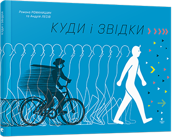
RR & AL: In the end of 2020 our newest book was published, it’s titled On the Move, and it is about movement and travel—not only by people, but also that of animals, plants, the wind, water, and our planet.
We like projects which are on the edge between fiction and non-fiction, art and philosophy, so we’re continue to work in this direction. The book we are creating right now is about contact and interaction between people, animals, plants, nature etc. We don’t have final title yet, but the book is on its way.)
LTPB: If you got the chance to write your own picture book autobiography, who (dead or alive!) would you want to illustrate it, and why?
We would love if it could be Bruno Munari. His philosophy of art and design is true guideline for us. His way of thinking had no boundaries, his works are filled with sense of humor and experiments. A true merge of art and design, lightweight visual narrative with hidden senses is what we value the most.
Two big thank yous to Romana and Andriy for talking to me about their work! Sight: Glimmer, Glow, Spark, Flash! published last week from Chronicle Books!
Special thanks to Romana, Andriy, and Chronicle for use of these images!


Коментарі
Щоб залишити коментар, необхідно